Harper’s Bazaar’s Hallowe’en Beauty Inspiration from the AW13 Shows

(Images via Harper’s Bazaar US. Click on images for captions and gallery view.)

Happy Hallowe’en all!

For the night that’s in it, a quick beauty post of two images from Harper’s Bazaar’s inspired Hallowe’en slideshow of the AW13 collections entitled ‘Freaky Chic: Hallowe’en make-up ideas straight from the runway.’

Of all the looks, mine would best be described as two parts ‘Vampire Diaries’ (Oscar de la Renta AW13), on the left, and one part ‘Night Walker’ (Gareth Pugh AW13), on the right.

Which are you favourites?! And what are you dressing up as?

This slideshow requires JavaScript.

(Oscar de la Renta, AW13 and Gareth Pugh AW13, images via Vogue UK.)

Bisou! Bonne soirée!

Sinéad

Editorial: ‘Dark Star,’ Harper’s Bazaar UK, September 2013

(Styled by Cathy Kasterine, photographs by Tom Allen, model Iris Van Berne. Hair by Raphael Salley. Make-up, Thomas de Kluyver, using Chanel. Production, Johnny Bamford. Stylist’s assistants Benjamin Canares and Vincent Pons. Location: Dartmoor. Click on images for captions and gallery view.)

I had intended to feature a different fashion story as my first editorial post (which will follow) but then came to the realisation that since so much of this blog hinges on the Harper’s Bazaar UK ‘Dark Star’ shoot (as I explained in my first post) and since it was so beautifully done, that it would be good to include it here in full. The story begins: ‘Part governess, part queen of the night, this season’s heroine is a vision from a gothic romance on the wilds of Dartmoor.’ And you can be sure that its influence will be felt from exclusive department stores to the high street this season.

I always think there is such an ephemeral quality to fashion editorials: they are published, are circulated for a month, and then often disappear from sight; the best ones leaving their imprints on the imagination. Of course magazines are kept like treasures by some readers, and some of their images are available online for others who go looking; but often when photographs appear online the full styling credits are lost, so you have to guess as to what exactly the model is wearing.

So in case any of you who read my first post were wondering who created the incredible billowing black dress (Gareth Pugh: one of his ‘bin bag’ dresses, with a raffia-like quality) or pearl-studded coat (to order from Alexander McQueen), here are the styling (garments, accessories) credits to accompany the photographs. If you click on each image, it will bring up a gallery view and caption. All styling credits are also listed below.

Enjoy!

Bisou,

Sinéad

================

From top, left to right: black wool and angora dress, Rochas. Black leather boots, Manolo Blahnik. Gold and ruby earrings, Stone Paris. Sequined and beaded silk dress, gold-plated metal crown, both Dolce & Gabbana.

Silk blend dress with Swarovski pearls, Emilia Wickstead. Boots, model’s own. Embroidered dress, suede belt, both Prada. Silver tiara, Maria Nilsdotter. Gold and ruby earrings, Stone Paris.

Cotton shirt, flannel skirt, cashmere and leather cape, all Hermès. Boots, model’s own. Black viscose and polyester dress, matching jacket, and resin necklace, all Christopher Kane.

White silk poplin shirt, black crepe skirt, both Balenciaga. Gold and ruby earrings, Stone Paris. Bin bag dress, Gareth Pugh. White gold and diamond earrings, gold and diamond ring, both Stone Paris.

Taffeta gown, Ralph Lauren Collection. Rose gold and diamond earrings; rose gold and diamond ring, Stone Paris.

Wool cashmere sweater, knitted flannel skirt, silk coat,  all Céline. Gold and ruby earrings, Stone Paris. Boots, model’s own. Black silk and lace dress, Gucci. Gold and diamond earrings, Annoushka. Black grosgrain ribbon, VV Rouleaux.

Silk blouse, Francesco Scognamiglio. Silk blend dress, Roberto Cavalli. White gold and diamond earrings, pendant, rings, all Stone Paris. Leather coat with pearls, chiffon and organza shirt with pearls, both Alexander McQueen.

Dries Van Noten’s Golden Moment SS14

(Images via Vogue. For all images, click for caption and gallery view.)

To the Halle Freyssinet in Paris, a huge industrial railway space built alongside the tracks of the Gare d’Austerlitz in the late 1920s, Dries Van Noten brought both sides of the bright-dark spectrum with his SS14 collection. He gave us a sense both of refined warmth and edginess, and as always exquisitely wearable clothes.

Clothes that we want to wear now: gilt ruffle down the side of a white dress, yes please! Ruffles on a sweatshirt; again, yes! Sleek tailoring in black, dresses with a sense of evening drama, brilliant separates that could be mixed and matched for night or day. An amazing barbed wire print that managed to look delicate yet dangerous.

(Images via Vogue.)

To the sound of Colin Greenwood (of Radiohead)’s bass solo, in this vast industrial, golden-hued set, the palette stretched from white to black, with reds and ochres the principal colours besides. Embellishments of gilt edging and ruffles on (and in) brocades, metallics, textured knits, guipure lace, silk, linen, cotton and voile, were matched with folk references and floral patterns.

The prettiness of opening looks in white and gold was built up and then contrasted with a trouser, a blouse, a blazer, an embellished tunic, and then full looks, in black. Hints of gold were found in the models’ hair partings and on their eyelashes. The understated and unexpected barbed wire print in black on ochre on a hip-skimming Fortuny pleated skirt, where it seemed like a motif of reeds or bare branches, was seen again on a skirt made entirely of ruffles; the barbed wire only becoming clearly apparent when the print appeared again on a beautiful ruffle-embellished dress.

(Images via Vogue.)

After ochre, came red: the introduction of red on black, and the picking up of SS13‘s floral motifs, in this collection frequently embellished with sequins and instead of ‘grunge couture’ pastels the bold contrast of red on black (which usually seems so 80s, but here, just seemed, well, striking). (Tim Blanks coined the phrase ‘grunge couture’ very aptly after the SS13 show, which I loved and will write about in another post:  it spoke to my inner haute-bohème grungified teenager (I know, I know!), still present in spirit if not in sartorial choices. I was also a teenager who favoured white Peter Pan collars and cuffs on black minidresses à la Valentino AW13 – still do – but that is another post in the making.)

(Images via Vogue.)

In the post-show video piece for Vogue, Dries speaks of pushing the idea of embellishment and seeing how far he could go. Ruffles were the dominant embellishment, from neat frills in unusual places (the side seams of the first look for example)  to multiple rows in a skirt made of ruffles. The romance of peasant-blouse shapes mixed with folk references: re-imagined Peruvian, Moroccan and Indonesian textile embellishment and cowrie shell detailing (which appeared again on sandals); prints encompassed stars, again on an ochre base, tiny dots, red on black, and the branch-like barbed wire print, black on ochre.

The colour palette and print theme extended to accessories, with Chelsea boots, and flat and heeled sandals, in python and alligator, red-on-black, ochre-on-black. Stars also featured in jewellery, strewn around wrists and on collarbones. From the graphic floral motif seen in SS13, to the exploration of tulip references which appeared more like seventeenth-century botanical prints, and at which point the palette expanded to encompass other colours, other tones, there was a clear nod to the SS14 menswear collection shown in June, and references to the collections of the Musée des Arts Décoratifs in Paris, which will (excitingly) showcase the designer’s work in its forthcoming Dries Van Noten exhibition, to be held in early 2014.

(Images via Vogue.)

The alternating of dominant white and dominant black was striking, moving between prettiness and edginess throughout the collection, as Dries explained in the Vogue post-show video, and effortlessly between day and night. The ruffles theme was extended to sportswear elements, with embellishment over shorts, then ruffles on sweatshirts.

Always thinking of the customer and the wearability of his garments, black, white, grey and gold were the dominant colours of the final looks, simplifying and distilling the essence of the collection, while pushing embellishment to fantasy limits, for a clear message to the buyers, editors, assembled media and beyond them the customers; with the final look seeming celebratory, almost bridal in its effusion of ruffles; looks set against a gold background, sent out to the sounds of Colin Greenwood’s bass. Stripped back as a soundtrack – echoing the menswear show’s solo drummer – but highly charged, like Dries’s beautiful want-to-wear-(or customize-what-I-have)-right-now SS14 collection.

This slideshow requires JavaScript.

(Images via Vogue.)

What do you think: to ruffle or not to ruffle?

A la prochaine, bisou!

Sinéad

================================

For SS14 show video, see Dries Van Noten.

For full show looks, close-up and  backstage details, and post-show commentary from Dries, Cathy Horyn, Valerie Steele and others, see Vogue (scroll down for video).

For Beauty Report, and details on ‘gilded accents’ in hair, and on eyelashes, see US Vogue.

Retrospective Look, Carousel, Louis Vuitton SS12

Louis Vuitton SS12 via Harper's Bazaar UK

(Image via Harper’s Bazaar UK. For all images, click for caption and gallery view.)

I wasn’t intending to do an entire post on the Louis Vuitton SS12 carousel show (or at least, not immediately) but since Paris Fashion Week have been thinking a lot about Marc Jacobs’s ability not only to surprise his audience but to create clothes that reflect different aspects of the bright-dark spectrum. Of course, he is doing this at the highest end of ready-to-wear, but the impact filters down to the high street and to street style, which saw a new focus on confectionery-like dresses and blouses for spring in the wake of this show, not to mention bouffant up-dos held in place by sparkly Alice bands.

The SS12 carousel show came after the AW11 fetish collection, and both shows placed Kate Moss in star position, the last model to exit, in AW11 controversially smoking a cigarette as she walked, in laced-up fetishistic black knee-high boots, high-waisted tailored pants and an embellished jacket with guipure-like cut-out leather bodice, Peter Pan collar, large buttons and oversized textured fur sleeves emphasising her waist, tiny leather gloves, and the ubiquitous Alice band-mask in her hair (which reappeared on Edie Campbell’s cap for SS14). With its Peter Pan collars, big buttons and 1960s shapes, the SS12 collection was not as far removed from AW11 as might be thought at first glance, even though the palette, fabrics, embellishment and overall aesthetic was so different (more Mary Poppins than The Night Porter).

(Images via Vogue)

In a telling short Vogue video piece in which they discuss the SS12 collection, Jacobs and his right-hand woman, stylist Katie Grand, both discuss wanting to explore the idea of ‘sweetness’ after AW11 (Grand also notes the idea of doing the opposite of what had come before, which Jacobs talks about in ‘The Louis Vuitton Woman’ interview, which I refer and link to below.) In the Vogue piece, interviewer Tim Blanks tells Jacobs that recently he’d had a conversation with Miuccia Prada in which she’d said that fashion is scared of sweetness. Jacobs responds: ‘There’s no-one I believe in more than she’… acknowledging that sweetness and niceness are disparaged, and mentioning the words fragile, vulnerable, tender, and how those things are not thought of as strengths but weaknesses. He discusses how they started the collection by thinking about light, airiness, ‘colours that are pleasant and kind,’ and what that could mean in terms of dressing for spring. The carousel idea reminded him of  the fair held in the Tuileries garden in springtime, a moment when things seem possible. (So why not, in terms of sweetness in fashion?)

An astonishing show, theatrical and magical, as Tyrone Lebon’s short film, ‘Louis Vuitton SS12, Backstage for Love Magazine’ captures; with the carousel and forty-eight models seated on horses all hidden until the start of the show under a white curtain, which was raised to the sound of crystalline music (which also featured at the very start of the SS14 show). The clothes and accessories were exquisite garments of ice-cream coloured pastels with navy accents, but if you looked closely, hadn’t lost the established Vuitton edge: pointy silver capped shoes,  alligator biker jackets with zips, and the high-waisted pants still present, this was the antithesis certainly of the provocative AW11 collection, but the sixties aesthetic, in oversized sleeves, Peter Pan collars, Alice bands, heavy-lidded make-up and pale skin, was still a feature, and gave the collection its reference point in terms of era.

This slideshow requires JavaScript.

(Images via Vogue)

I would imagine that for many of the buyers, editors, photographers and journalists present, this aesthetic probably made them think of photographs from the 60s of their mothers in spring- and summer garb, on beaches and in the countryside, whether in Europe or further afield, with kohl-eyes and bouffant hair in headscarves chicly and nonchalantly tied. Looking at such photos, which always seem so carefree, it is easy to imagine an apparently more innocent time. Or at least, this is what the SS12 Vuitton collection made me think of, at first at least.

The ice-cream palette, with its navy additions, in dresses, coats, shirts and playsuits, with elements of broderie anglaise, guipure lace, transparent layers, appliqué and laser-cut patterns, sequin and feather embellishment, was (as widely noted at the time) more couture-like than ready-to-wear. In a revealing pre-show interview from October 2011, ‘The Louis Vuitton Woman,’ Jacobs speaks of the need for change in fashion, and of many ‘really interesting and… sort of challenging’ conversations with Mr. Arnault, Chairman and CEO of LVMH; attempts to establish who ‘she’ was, this Vuitton woman, within the pattern of seasonal changes in fashion. When pressed, he reveals that he didn’t design for or think of any one ‘Vuitton woman’  (of course there is an element of PR in this) but said that rather he imagined her as a woman ‘who wants to be seen, wants to be noticed, an extrovert certainly, and strong, whether she’s gentle… youthful or mature,’ and this is something we saw again with SS14 and the appeal to women across the age spectrum.

He also made the point (when referring to the fetish theme of AW11 in the Vogue post-show interview), that ‘it’s not who we are, it’s just how we dress.’

When you apply this to the idea of dressing up, from high end to high street, it shows just how transformative clothes can be.

It will be fascinating to see how he brings this capacity for apparently boundless imagination and re-invention to his eponymous brand, with greater investment planned for the years ahead by LVMH. Certainly, whilst at Vuitton, the fashion-week world was his (and our) playground.

Bisou!

Sinéad

===================================

For full Louis Vuitton SS12 show, see Dazed Digital, ‘Marc Jacobs’s Vuitton: A Visual Journey’ (scroll down).

See also Tyrone Lebon’s atmospheric short film, ‘Louis Vuitton, Backstage for Love Magazine.’

For pre-show interview with Jacobs, see ‘The Louis Vuitton Woman.’

For post-show interviews with Jacobs, Grand, and others, see Vogue (scroll down for video).

For post AW11-show interviews and commentary, see Vogue (scroll down for video).

Dark Star Showgirls: Marc Jacobs for Louis Vuitton SS14

(Images via Vogue. For all images, click to enlarge and for gallery view.)

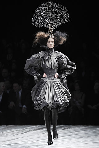
Marc Jacobs’s final show for Louis Vuitton on Wednesday 2 October was a spellbinding nocturne fantasy in jet-black and navy. Showgirls in extraordinary peacock- and pheasant-feathered headdresses by milliner Stephen Jones walked to what felt like a Philip Glass soundtrack (details yet to be released), funereal to begin with, then insistent and uplifting, on a set which brought together elements from past Jacobs-for-Vuitton shows, now painted lacquered black. A Place de la Concorde-like fountain, carousel, hotel doors opening onto an upper landing, escalators and ornamental caged lifts with obliging doormen: all present.

This slideshow requires JavaScript.

Edie Campbell opened the show, with incredible poise and arms held aloft; strings of jet jewels attached to her wrists, with more than a nod to the AW11 Fetish Collection. Almost completely naked but adorned with glittering black Stephen Sprouse-graffiti body paint spelling out Louis Vuitton Paris, this look jubilantly declared the success of the Jacobs-Sprouse collaboration, beginning in 2001, which saw Vuitton’s classic bags splashed in Sprouse’s graffiti logo. The logo now stands for many things: Jacobs’s irreverent approach, his moment of  ‘arrival’ and the beginnings of cult-brand success for Vuitton.

A navy and black chequered sheepskin-covered set gave the impression of an abandoned grassy Belle Epoque fairground, or a neglected corner of demi-monde Paris and cleverly referenced the classic Vuitton Damier (chessboard) pattern; also of course the ready-to-wear SS13 collection.  A scaled-down version of the SS12 carousel, in glittering black, revolved in the background, with more headdress-wearing, sheer-and-jet-black clothed showgirls sitting on the horses, holding ostrich-plume fans. The Place de la Concorde-like fountain (a theme of AW10) took centre stage, somehow reminiscent of the ballet-finale set of an American in Paris but in monochrome, with the isolation of iconic Parisian images in the service of this classic luggage brand, totally re-invented during the sixteen-year tenure of Jacobs as a fashion house both achingly cool and exquisitely wearable.

(Images via Vogue)

In front of the fountain, Jacobs’s models, in cutaway lattice tunics, sheer body suits and tank dresses overlaid with jet embellishment, delicate art deco panelling, embroidery, petit pois voile, and full-length bias cut dresses straight from the 1930s brushed against girls in jeans and luxe sportswear, with neat boxy or military jackets cropped close to the body and embellishments of jet, stones and feathers, as if the girls had discovered vintage gems in their grandmother’s trunks in the attic and tried precious pieces on over the top of their jeans. And now didn’t want to take them off. Like, ever. The girls carried mini drawstring bucket bags, and wore flat alligator-skin ankle and biker boots. In certain looks, delicate Victorian jet embellishment gave way to punky chains attached to waistbands, and again, the fetish theme resurfaced in the lace-up fastening of one pair of trousers where otherwise would have been placed a zip or buttons.

(Images via Vogue)

Embellishment was everywhere: feathers, beading, stones, on shoulders, sheer panels, over voile and on crepe. If the sense of time passing in reverse was clearly apparent from the backwards-ticking Vuitton clock (Jacobs’s departure from Vuitton had been strongly rumoured in preceding weeks, and was confirmed immediately after this show), then Jacobs was hurtling with his 1930s showgirls into the future, bringing with them timeless embellishment, the traditional jet of Victorian mourning and the patterned Art Nouveau wallpaper decorating the upper landing. The entire lift sequence was evocative of such mixing of references and eras: girls rising in a caged lift, a lift only opened by doormen, then descending to the fairground again, independently, on ultra-modern escalators.

There were homages to Miuccia Prada’s jewel-embellished black dresses, coats and jackets; to Chanel and Schiaparelli; I also thought of the first half of Alexander McQueen’s AW08 show:

Macio Madeira VOGUE.com aw08

(Image via Vogue)

This was a show which not only showed off the superficial, the decorative approach, which Jacobs insisted on in his show statement, but went much deeper, in spite of Jacobs’s nonchalance. Design traditions, hand-stitched jewels and beading, deco cut-out patterns, 1930s style evening gowns, tunic dresses with epaulettes, cornflower-blue jeans, both fitted and boyfriend style, slouchy pants, biker boots, luxe sportswear, cropped leather jackets:  all were brought together through Jacobs’s sombre palette and celebratory approach to embellishment, Katie Grand’s impeccable styling, Pat McGrath’s gorgeous fresh-faced but dark-browed make-up, Guido Palau’s un-fussy hair styling with messy buns and wisps of hair caught in the headdresses, and  by Jones’s extraordinary feathered creations, which according to Vogue, required a 2:30 a.m. call time (for a 10 a.m. show).

Jacobs’s written statement also highlighted his female inspirations for the collection, past and present; the collection was dedicated to them ‘and to the showgirl in every one of them’: Schiaparelli, Chanel, Vreeland, Piaf, Garland, Streisand, Cher, Wintour, Coddington, Prada, Alt, Coppola, Moss, Grand and many others, thirty-four in total. This list illustrates the thinking behind the collection’s very wearable and beautifully cut pieces. Aimed both at potentially conservative mature clients (beautiful full- and bracelet-length, sleeved, tunic-style, below-the-knee dresses, Kate Hepburn trousers, boxy jackets) and the younger set (cropped navel-baring jackets, sheer embellished panels, biker boots, jeans, slouchy trousers; the fetish references), it also transcends categories and age brackets by giving us what we always came to Jacobs’s Vuitton shows to see: a fantasy moment, signalled here by the set, the soundtrack, the extravagantly poetic, almost fairy-tale, headpieces and stunning embellishment of the collection itself.

(Images via Vogue)

Jacobs’s showgirls circulated proudly, like creatures belonging to another world, but  – as Jacobs and Vuitton know only too well – it is one that can be accessed in an imaginary way through dressing up. Celebrating fantasy-through-dress, the final look of the show included a bustle made of pheasant feathers, as if a tail was emerging from the back of a jacket. (This was not captured in the catwalk photographs, but can be seen in the show video, linked to below.) This look seemed to suggest a metamorphosis of sorts, as is so often the case in fashion, and certainly now for Jacobs as he leaves Vuitton to focus on his own brand (which is owned by Jacobs, long-term business partner Robert Duffy and LVMH), in advance of its IPO in the next three years.

This show was firmly focused on a fantasy of dressing up and embellished luxury mediated through the theme of the colours of mourning. It was the through-the-looking-glass reflection of SS12 ‘s carousel of bright star Alices: Jacobs’s dramatic, jet-black, peacock-feathered, dark star moment.  For Jacobs it was a fantasy on a theme; the theme: his personal showgirl let loose in the Vuitton fairground.

Before the next adventure, his final dedication?

‘To the showgirl in all of us.’

A stunning exit.

Bisou!

Sinéad

==============================

For full show video, see Louis Vuitton SS14.

For short video featuring post-show comments from Marc Jacobs, Stephen Jones, Katie Grand, Susie Bubble and others, see Vogue.

For beautifully shot short film ‘Love presents Louis Vuitton SS14, Behind the scenes’ see The Love Magazine.

Below: Photos, Lea Colombo, via Dazed Digital.

This slideshow requires JavaScript.

Bright Star Dark Star

(click on image for caption)

In September 2013, during Paris Fashion Week, this blog somehow became a reality. (And no-one is more surprised by this than I am.)

‘Bright Star Dark Star’ is a space for writing about the past and present of fashion: designers, dresses, blazers, accessories; coats, heels and hats; international collections, fashion week shows, fashion photography; editors, editorials, campaigns; exhibitions and museums. I’ll also post on fashion in art, film and history. (And I promise you now that future posts will not be as long, but I thought some background was important here to situate the blog, and me.)

My name is Sinéad Furlong-Clancy, I’m an independent art and fashion historian living in Dublin, previously in Paris and London (well almost London: Surrey), where I grew up. I’m also a writer, stylist, lecturer and consultant, with a PhD in art, fashion and nineteenth-century Paris, soon to be published as a book by Mellen, New York.

Often found very happily if busily balancing two schedules, a research/teaching programme and another fashion/style advising position, I have gained years of experience in the fashion industry, most recently working with international womenswear collections, personal shopping and styling, in The Designer Rooms at Brown Thomas Dublin, with favourites Dries Van Noten, Alexander McQueen, Balenciaga, Stella McCartney, Prada, Miu Miu, Chloé: the list goes on… This was before I became a Mum in late 2010 (something else ‘about’ me!) and decided to take the opportunity to work independently and focus on my book and research (not to mention my young family).

My first daily encounters with fashion blogs came while at Brown Thomas, in early 2009, when my then-boyfriend, now husband, and I would compare notes on The Sartorialist and Garance Doré via texts during breaks from work (and no, while very stylish, he is not in the field). I loved the back-and-forth, looking at their photographs capturing street style and fashion-week style; and also loved Garance’s illustrations, stories and wit, and Scott’s vintage photographs and the stories that came with them.

My Mum’s innate style, elegance and dressmaking skills were early influences, as were her fashion magazines, which opened windows into other worlds, at times ethereal, saturated with colour, or darkly gothic. This tension between the depicted bright world of fashion and its darker or more melancholy elements was made all the more apparent coming from a colourful mid-eighties childhood of polka dots and ra-ra skirts, to the heroin-chic grunge of my late teens. By that time, I was collecting the same magazines she had, and new ones like The Face and i-D, forming my own collections of images, ideas, inspirations, with mood board-like collages decorating diaries, folders, sketchbooks.  This continued through college and summer jobs, in tandem with graduate studies in Dublin and Paris, and summers researching at the Musée de la Mode de la Ville de Paris (the newly re-opened Palais Galliera) for my PhD on art, fashion and nineteenth-century Paris; also while teaching fashion students at the National College of Art and Design in Dublin.

The bright/dark contrast was perhaps even sharper for me as I lost my beloved mother to cancer a few months before my fourteenth birthday. What she wore, what she had bought for us to wear, what we shopped for together and what she had made for us as small children in exquisite Liberty print fabrics, all of these things shaped my memories of her; that and her incredible sense of fun and empathy, whether for children or adults. I still have and wear a beautifully tailored David Charles wool navy blazer that must have been one of the last things she bought for me (the label reads ‘age 14 years’). But all of her beautiful clothes were packed away soon after and given to charity, and this was another, secondary loss; her perfume, her warmth had seemed to fill the wardrobe space; for a few brief weeks I unpacked shoe boxes and stood in her shoes, where she had stood. Then it was empty. Justine Picardie considers ‘the life and afterlife of clothes’ in her moving, inspired and ‘courageously playful’ book My Mother’s Wedding Dress. But for my bereft but incredibly strong Dad, with four children aged between 6 and 13, it was the only way forward.

The Bright Star of the blog’s title is a reference to Jane Campion’s 2009 film Bright Star about John Keats and Fanny Brawne, which really resonated with me when I saw it first (and still does, it is incredibly powerful and beautifully shot… a Parisian friend recently messaged just after having seen it… my response: ‘Are you still weeping?!’… answer: ‘Yes!’). Why so significant? Bright Star opened at the Irish Film Institute two months after my then-boyfriend asked me to marry him (you can read about that and the story of my wedding dress, a couture gown by my friend, fashion designer  Sean Byrne, 2009 Young Designer of the Year, whom I knew from Brown Thomas,  in ‘Material Girl,’  by Kirsty Blake Knox, Sunday Independent Style magazine, April 2010). Campion’s film takes its name from Keats’s sonnet ‘Bright Star‘ written about Fanny Brawne; the inscription chosen by my husband for the inside of my wedding band (kept secret until after the ceremony) reads ‘My bright star…’ (For his ring I chose a lyric from French band Phoenix, ‘always and forevermore’… Not Keats I grant you, but we did see them at Barcelona’s 2009 Primavera, obsess about Wolfgang Amadeus Phoenix on many of our summer roadtrips, and get engaged at Electric Picnic, so…). For me ‘Bright Star’ has a personal resonance but it also contains a significant reference to fashion history: in the film’s depiction of early nineteenth-century London, Fanny Brawne designs, makes and wears her own very stylish clothes and accessories, and early in the film points out that she can make a living from what she does, in apparent contrast to the poets Keats and Brown.

Still from Jane Campion's 2009 film 'Bright Star,' with Abbie Cornish as Fanny  Brawne.Still from Jane Campion’s 2009 film Bright Star, with Abbie Cornish as Fanny Brawne.

For the blog, Bright Star also stands for the upbeat nature of certain fashion editorials, collections, shows; whereas Dark Star represents a melancholy, gothic, or subversive fashion heroine. (Of course in real life, this idea can extend to the way we think about dressing to suit different moods, times of day, events, locations, and seasons. Sometimes we might feel, or need to be, more dark star than bright… more night-loving rock chick than broderie-anglaise-wearing girl in a garden. Make-up has a big part to play in this too: from bare-faced to kohl-eyed, we play with different degrees of the bright-dark spectrum every day.) The exquisite ‘Dark  Star’ editorial in the September 2013 edition of Harper’s Bazaar UK, styled by Cathy Kasterine with photographs by Tom Allen and model Iris Van Berne, radiates strength in the best girl-in-a-wild-landscape editorial tradition. An example of perfect casting: a celebrity model would have overwhelmed the concept, the imaginary nature of this fashion story. Without this editorial, it is likely I would still be thinking about rather than writing a blog. The ‘Dark Star’ shoot was the catalyst:  I paired Bright and Dark Stars; and that was that.

This was Justine Picardie’s impressive first September edition at the helm of Harper’s Bazaar UK. A flurry of tweets between us about the sublime cover featuring Natalia Vodianova and ‘Dark Star’ shoot gave me the impetus to put my thoughts out there (out here, I guess, blogosphere!). And this feeling was compounded as I found myself collecting visual references for ‘Bright Star’ and ‘Dark Star’ as I worked on an art/fashion history paper for an Oxford conference in early September, where I found much inspiration and new friends, including Rosie Findlay, aka fashademic, whom I will write more about, a style blogger and PhD candidate at the University of Sydney whose subject is personal style blogs. Her interest in performativity reveals a focus on how bloggers selectively edit their lives/wardrobes/subject-matter, and this was also a spur to figuring out how I could share some of my thoughts and ideas in the blogging arena. Later in September, the ‘Bright Star Dark Star’ idea was still with me, vying for space in my brain, as I prepped for a lecture for the National Gallery of Ireland on fabric and fashion in Morisot and Renoir. With thoughts of the arena, Brené Brown‘s TED talk advice … don’t wait until you’re perfect; that will never happen, and anyway even if you were, that’s not what we want to see… was probably the ultimate impetus…

Finally, during  September 2013’s fashion weeks, as a relative newcomer to Twitter, only joining the action in April, I found myself wanting to share and comment more than was probably reasonable, aflutter with the instantaneity of it all, and I realised that a blog, my idea in the making, my ‘Bright Star Dark Star’ could be a place for such commentary. So here I am! (I promise that the posts will never be as long again!) Hope you enjoy it.

Sinéad

This slideshow requires JavaScript.

%d bloggers like this: